In today's digital landscape, having a responsive website is no longer a luxury, but a necessity. With users accessing the web through a plethora of devices—ranging from smartphones and tablets to laptops and desktops—it's crucial for websites to provide an optimal user experience across all platforms. Responsive web design (RWD) focuses on creating web pages that look good and function well on any screen size or device. This approach not only enhances user experience but also positively impacts SEO and conversion rates. Let's explore the best practices for creating responsive websites, along with some key insights into frameworks, tips, and tools.
Understanding Responsive Design
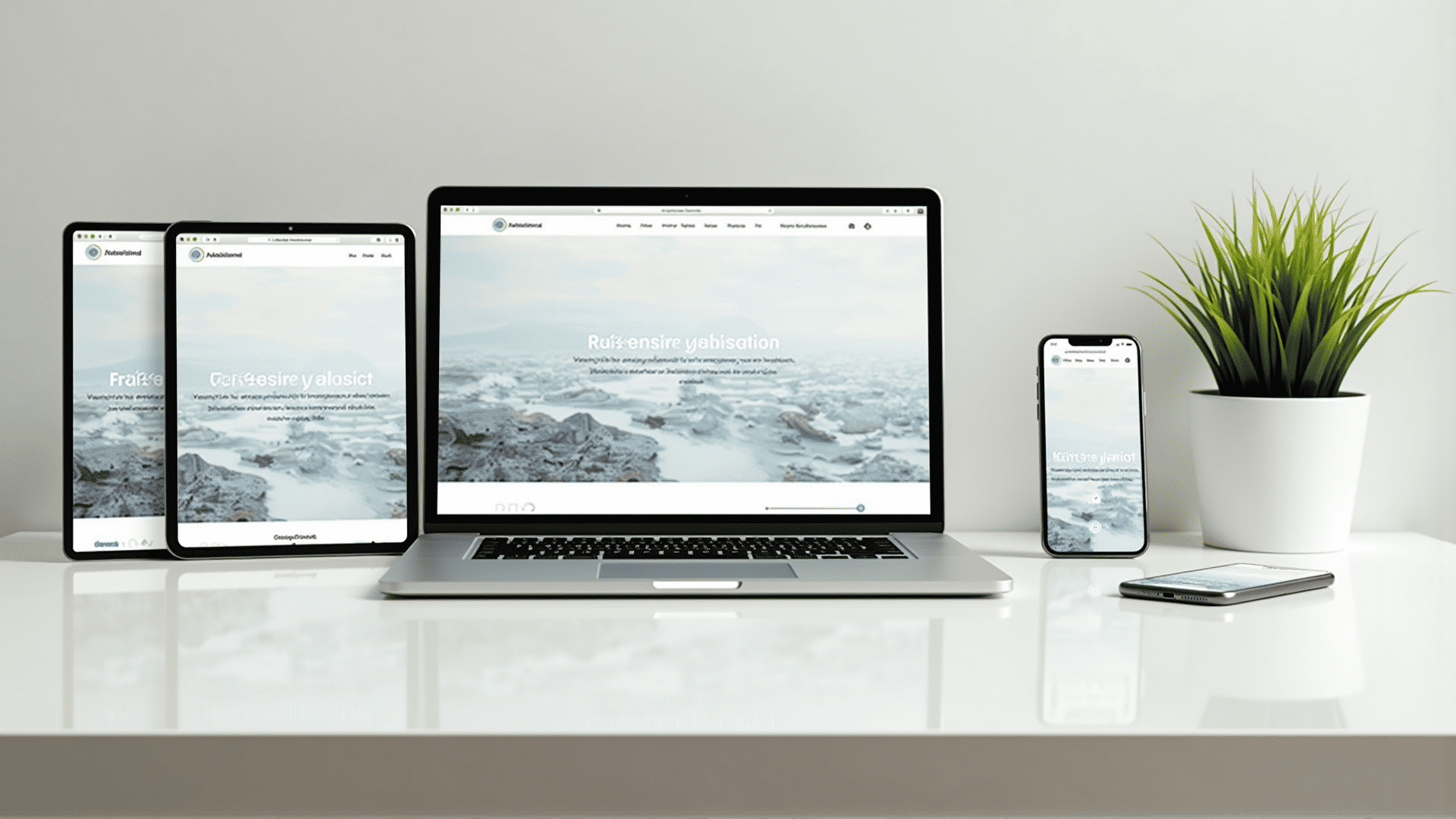
Responsive web design involves the use of flexible grids, layouts, images, and media queries to adjust the website's design based on the device being used. The primary goal is to ensure that the website looks seamless whether accessed on a mobile phone, tablet, or desktop.
Best Practices for Responsive Design
-
Mobile-First Approach: Start the design process thinking mobile-first. Given the rising number of mobile users, designing for smaller screens first ensures essential content and features are prioritized. Once the mobile layout is achieved, designers can then scale up for larger screens.
-
Fluid Grids and Flexible Layouts: Use a fluid grid layout that adjusts according to the screen size. Instead of fixed pixel dimensions, use relative units like percentages (%) to set widths. This adaptability is fundamental to creating a robust, responsive design.
-
Responsive Images: Make use of responsive images that can scale according to the device. The HTML
srcsetattribute can provide different image sources and resolutions to fit varying screen widths and resolutions without compromising on performance or quality. -
CSS Media Queries: Media queries are a cornerstone of responsive design. They allow the application of specific CSS styles based on device characteristics like screen width and resolution. By strategically using media queries, developers can ensure a cohesive look across devices.
-
Breakpoints: Identify and utilize breakpoints where the layout should change to enhance the user experience. Breakpoints typically align with common screen sizes, but they should be influenced by the design and content rather than specific device dimensions.
-
Touch-Friendly Elements: Ensure that interactive elements like buttons and links are large enough to be tapped easily on touchscreens. Adequate spacing between elements prevents accidental clicks and enhances usability on mobile devices.
-
Optimized Typography: Text legibility is vital for user experience. Use scalable and readable fonts, and adjust sizes with relative units like 'em' or 'rem' to ensure the text is proportionate across different screens.
Frameworks for Responsive Design
Several frameworks are invaluable when implementing responsive design:
-
Bootstrap: A front-end framework that enables faster and easier web development. It comes with pre-designed responsive grid systems, components, and utilities.
-
Foundation: Known for its flexible grid system, Foundation provides designers with customizable building blocks to cater to responsive design needs.
-
Bulma: A modern CSS framework based on Flexbox, known for its simplicity and modularity.
Tools for Responsive Design
-
Responsive Design Mode in Browsers: Most modern browsers have built-in responsive design modes for testing how your site looks on different devices.
-
Screenfly: An online tool that allows testing of web designs on various screen sizes and devices.
-
BrowserStack: Provides real device cloud testing to ensure that your responsive design works perfectly across various platforms and devices.
Conclusion
The journey toward creating a responsive website involves thoughtful planning and an understanding of user behaviors. By employing responsive design best practices, developers can craft experiences that are not only aesthetically pleasing but also more effective in reaching a wider audience. Embrace the flexibility of frameworks and the practicality of design tools to build sites that are ready to adapt to the future of digital interaction. In doing so, responsive design not only keeps pace with technological advancements but ensures consistency in delivering engaging and accessible content to all users.